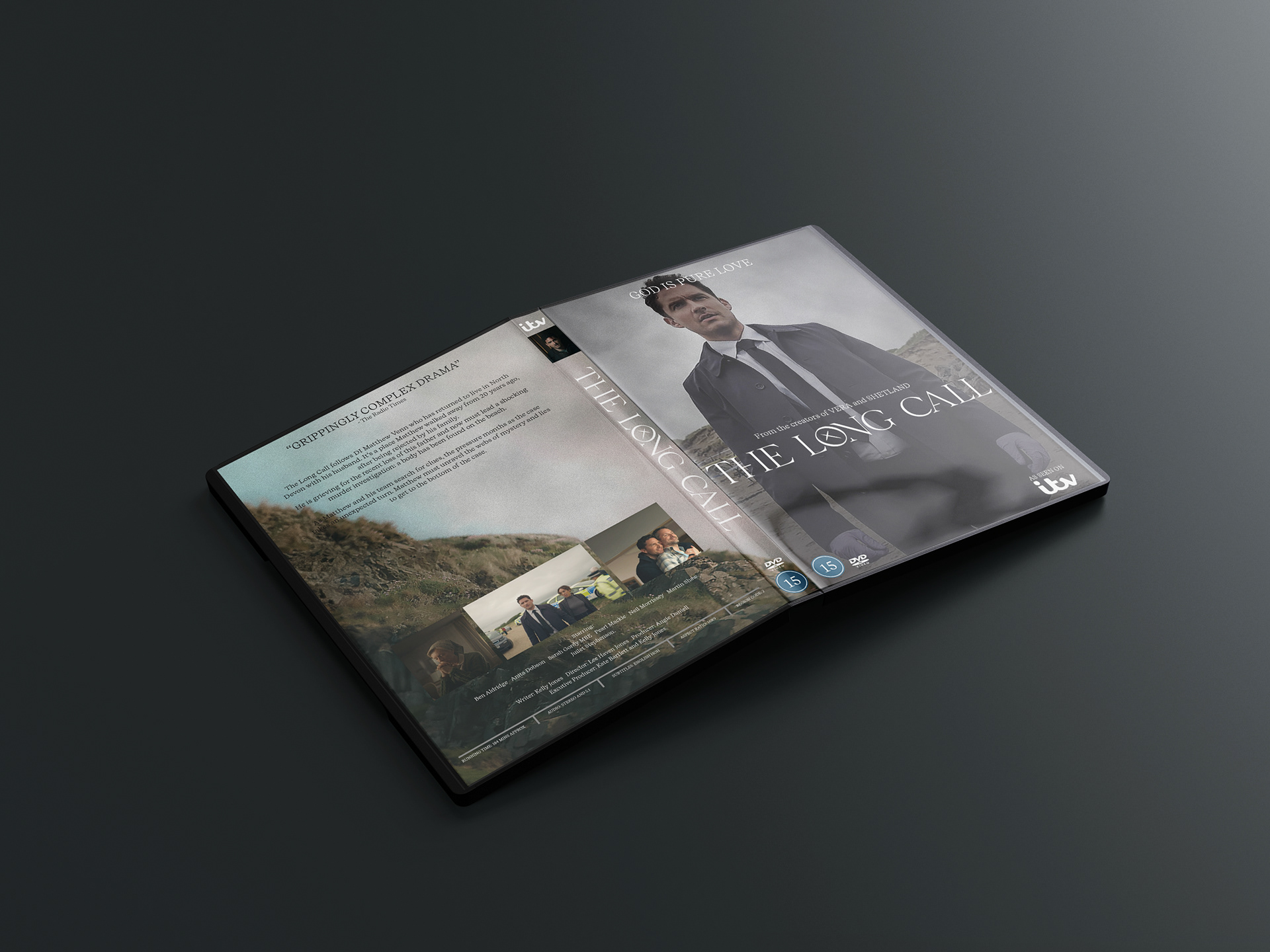
The Long Call (2021) is a TV show based on the book of the same name by Anne Cleeves.
There are three books, featuring the characters in The Long Call, despite being only one season of the TV series. Therefore, being inspired by Vera (another TV series based on books by Anne Cleeves) I came up with the hypothetical show of "Venn" that encompasses all the stories that feature DI Matthew Venn and his team, including The Long Call.
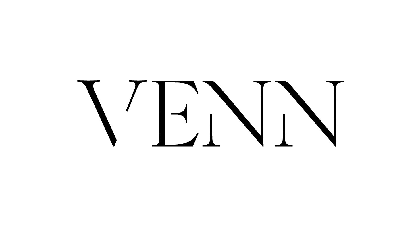
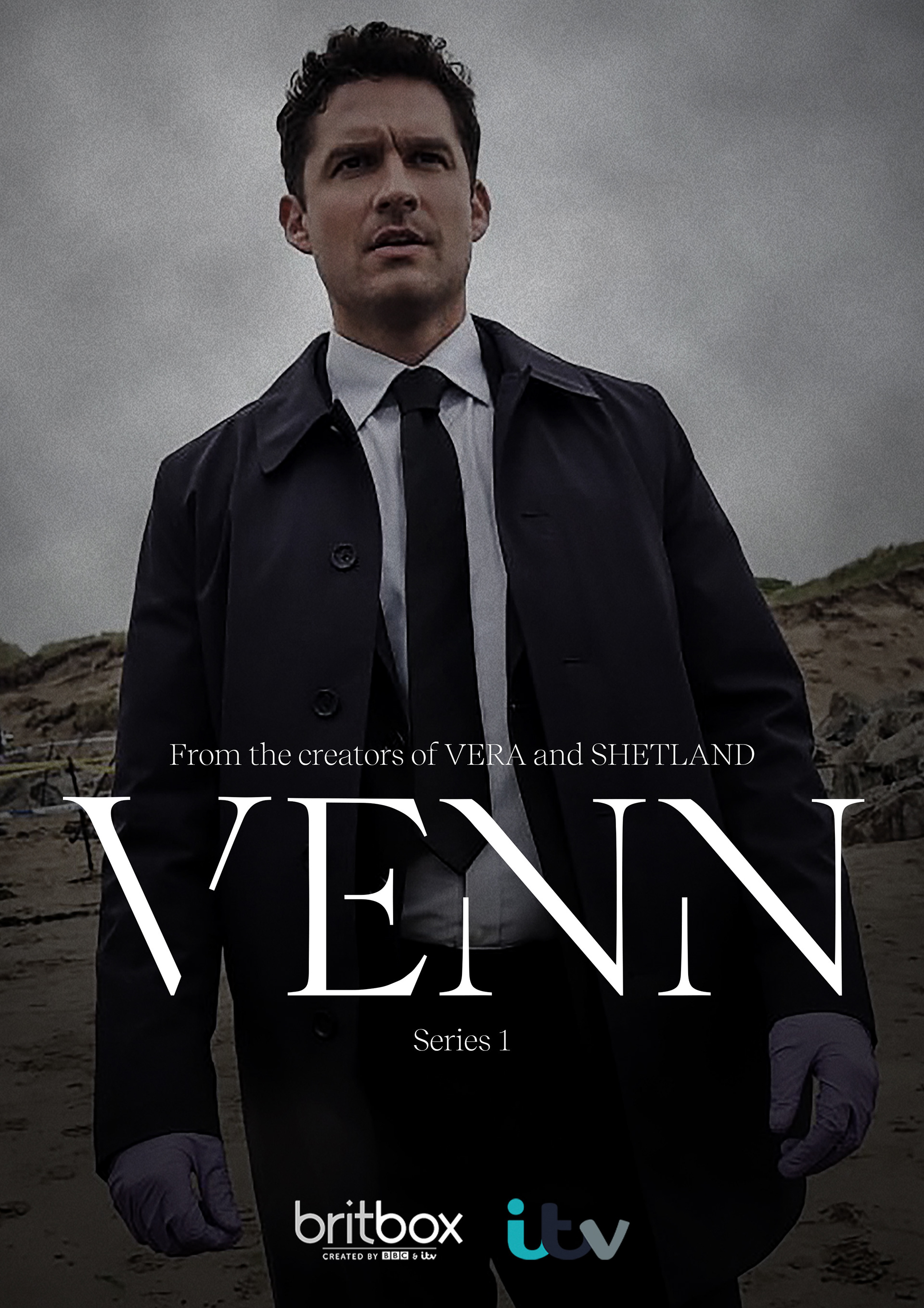
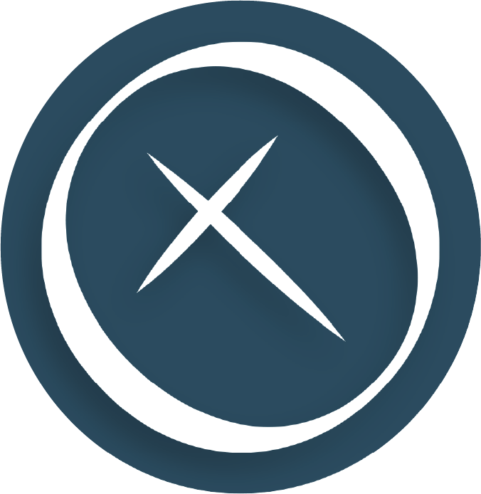
This is the logo I designed for the title of this show.
The letters are uncompleted to imply the mental state of our main character, DI Matthew Venn. Venn grew up as a queer kid in an evangelical cult-like religious group, therefore, deals with a lot of religious guilt about who he is. The broken letters represent that.
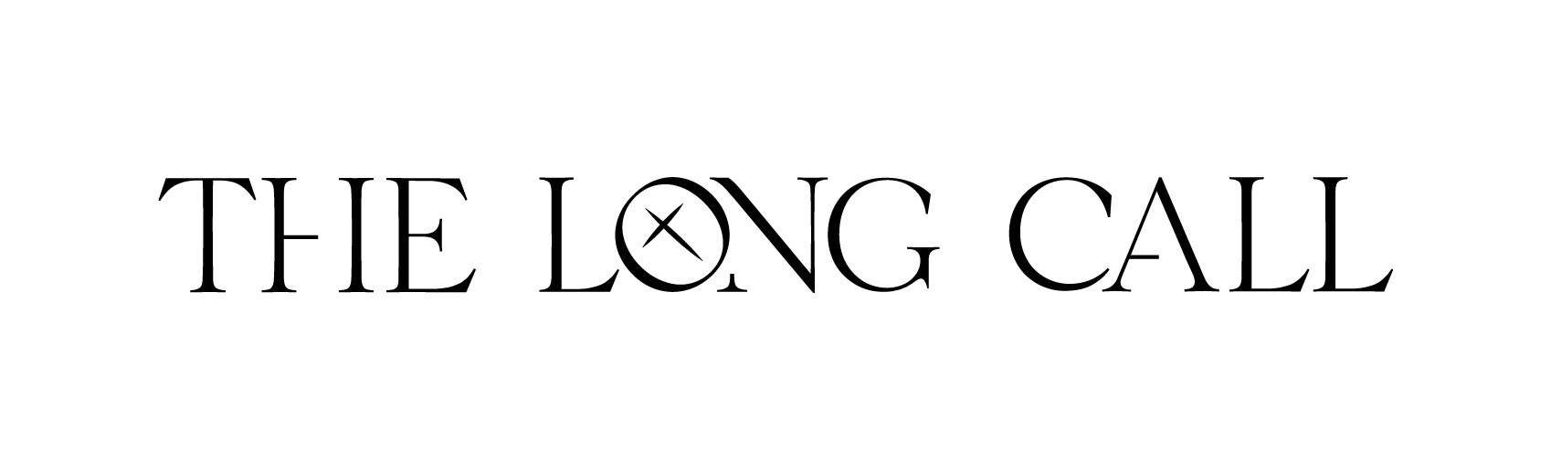
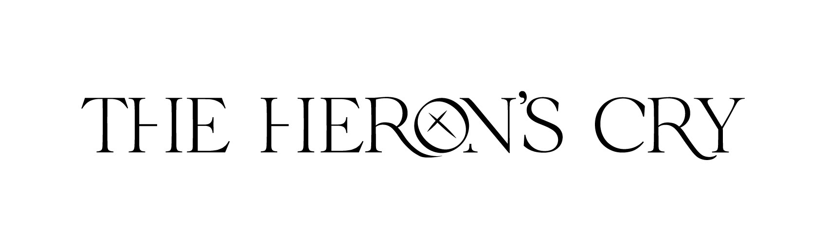
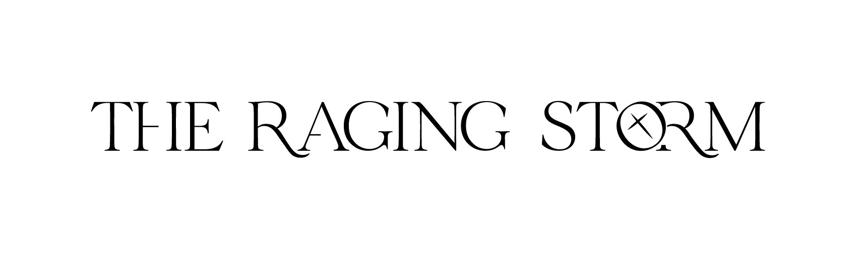
These are the title designs I created for each of the book/episode titles.
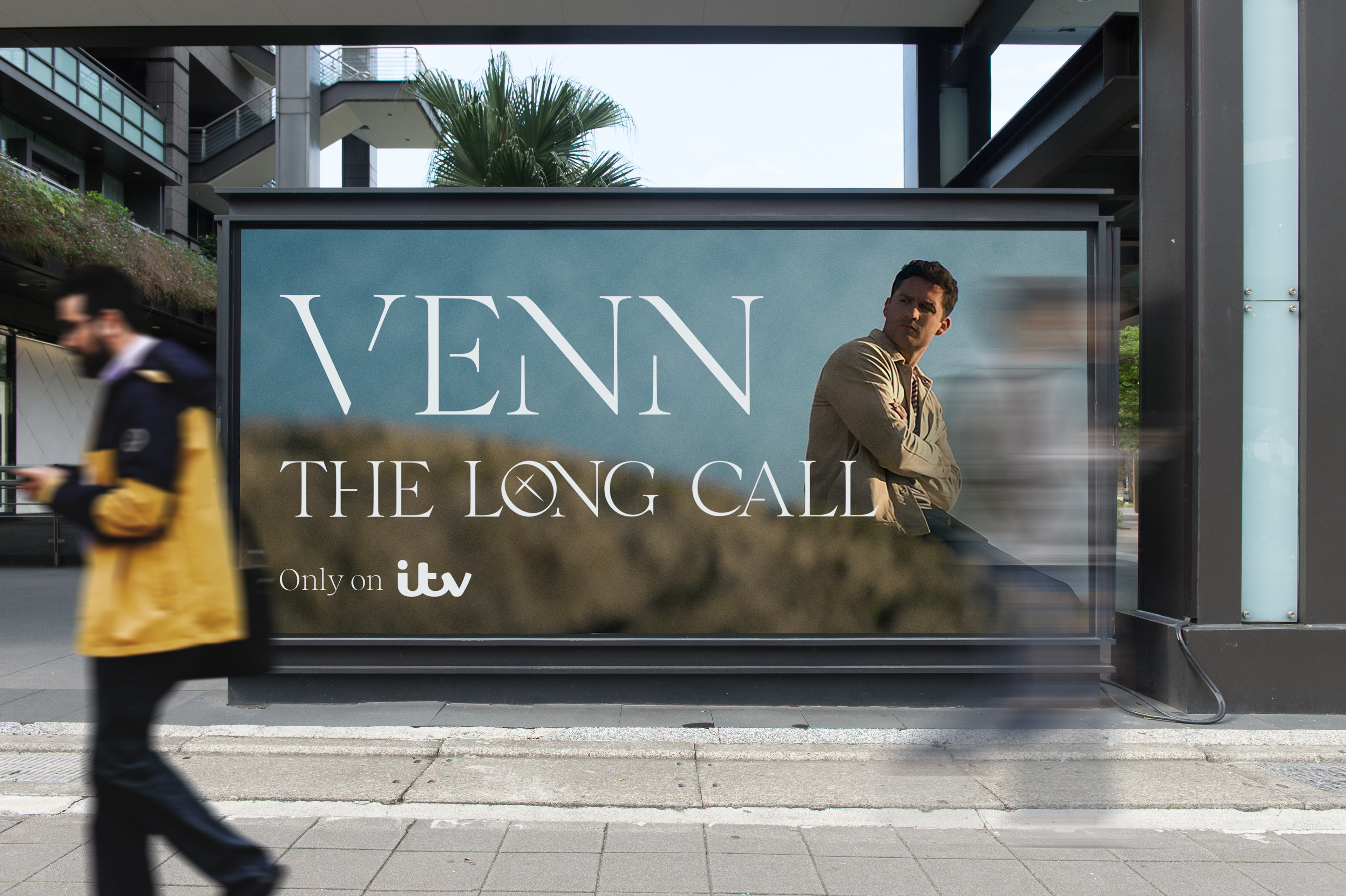
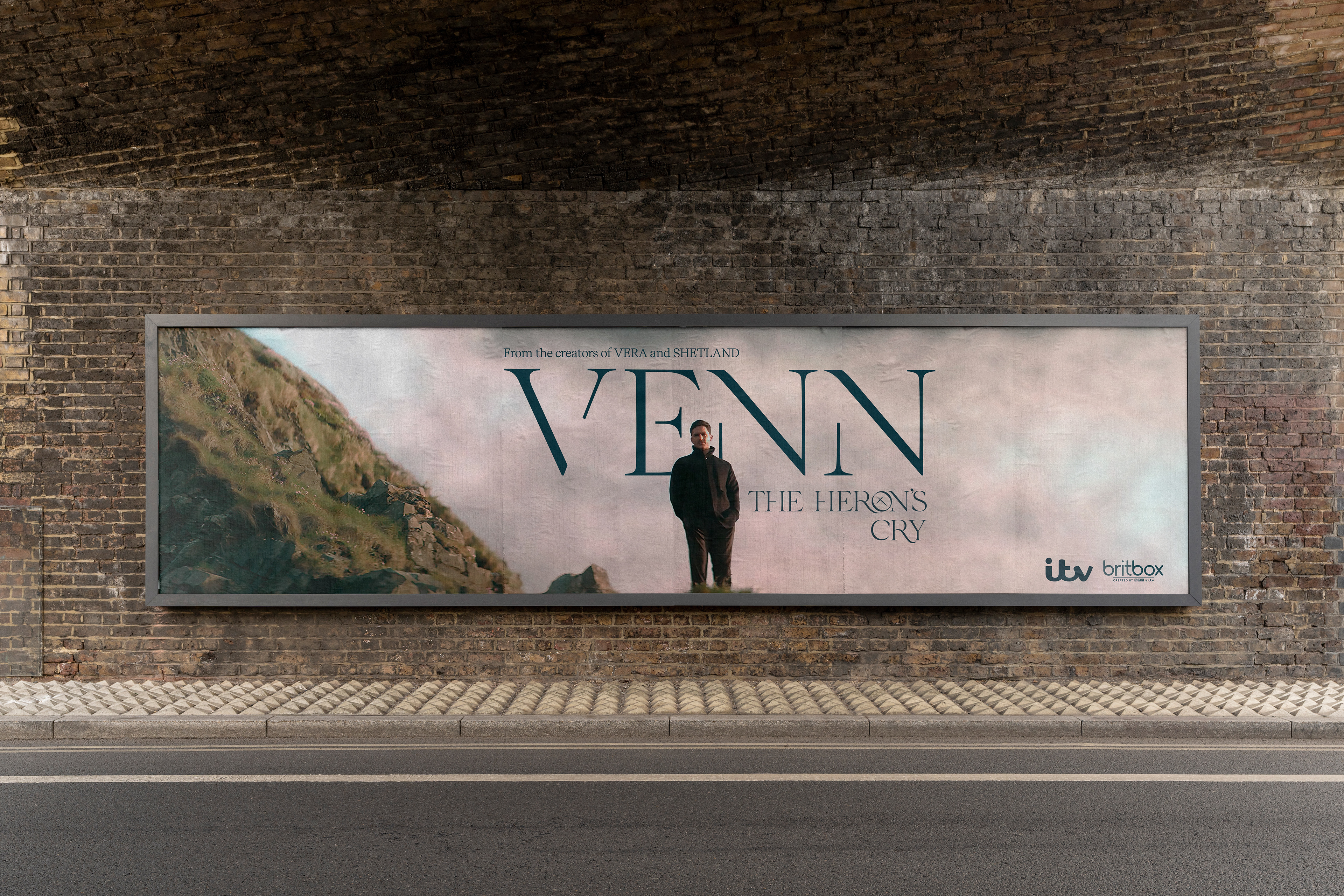
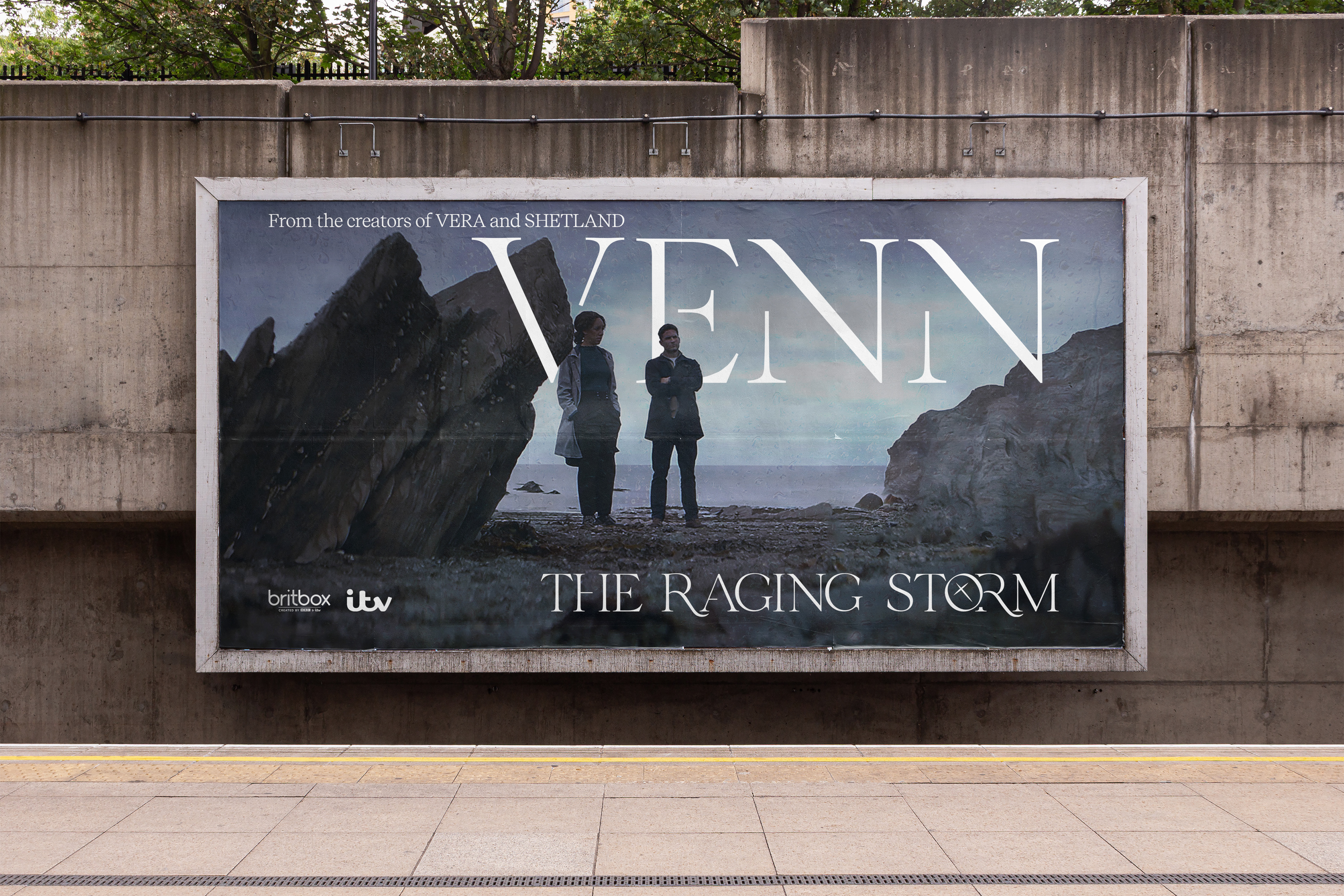
The typeface I chose is called Velour as it matched the gentle, subtle nature of the TV show while still keeping with the traditional aspect of the Barum Brethren, the evangelical religious group.
The crooked cross in the 'O's symbolises how the protagonist left the Barum Brethren at the age of 19 and, since then, has had a complicated relationship with religion.
The overall poster for the show
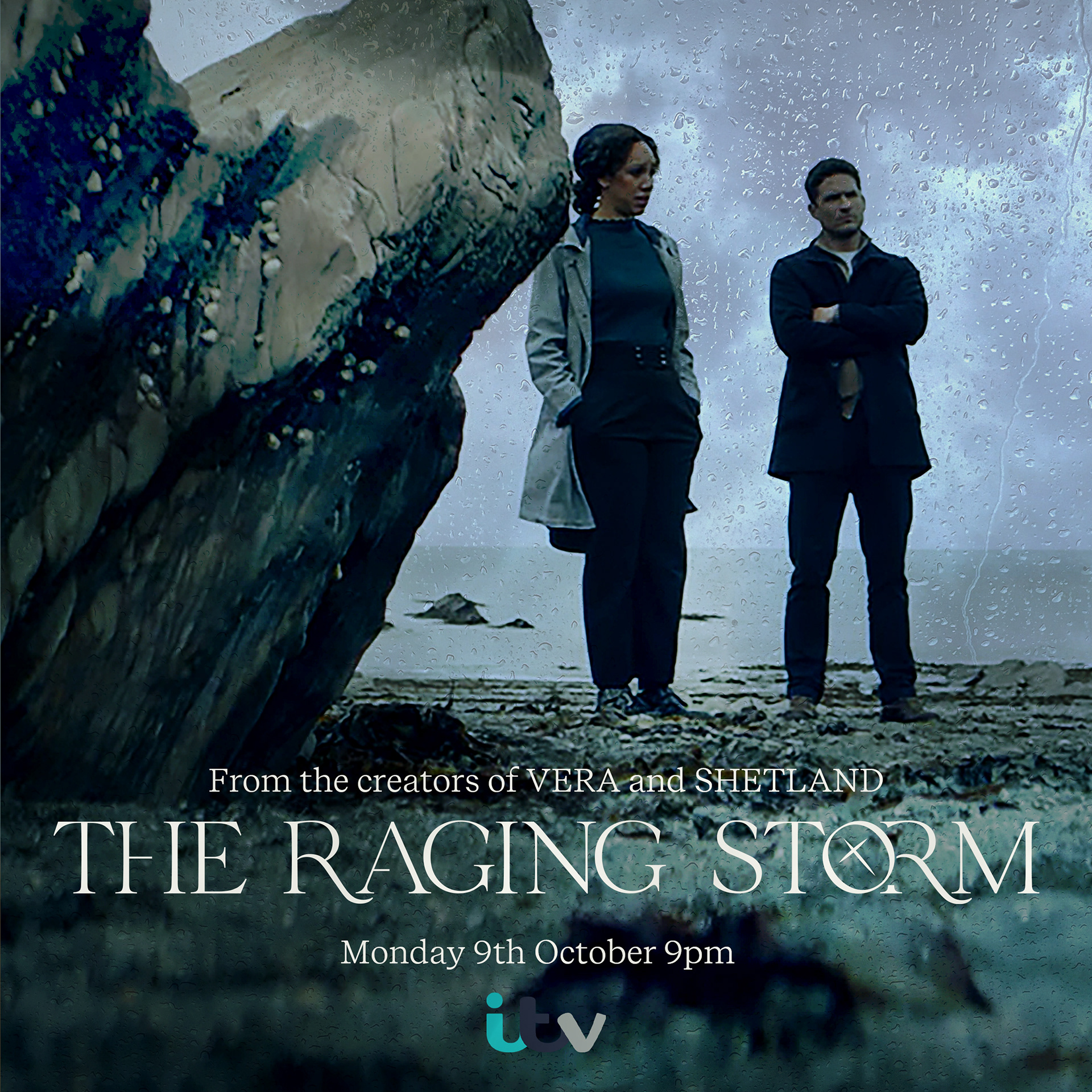
Posters for each of the episodes
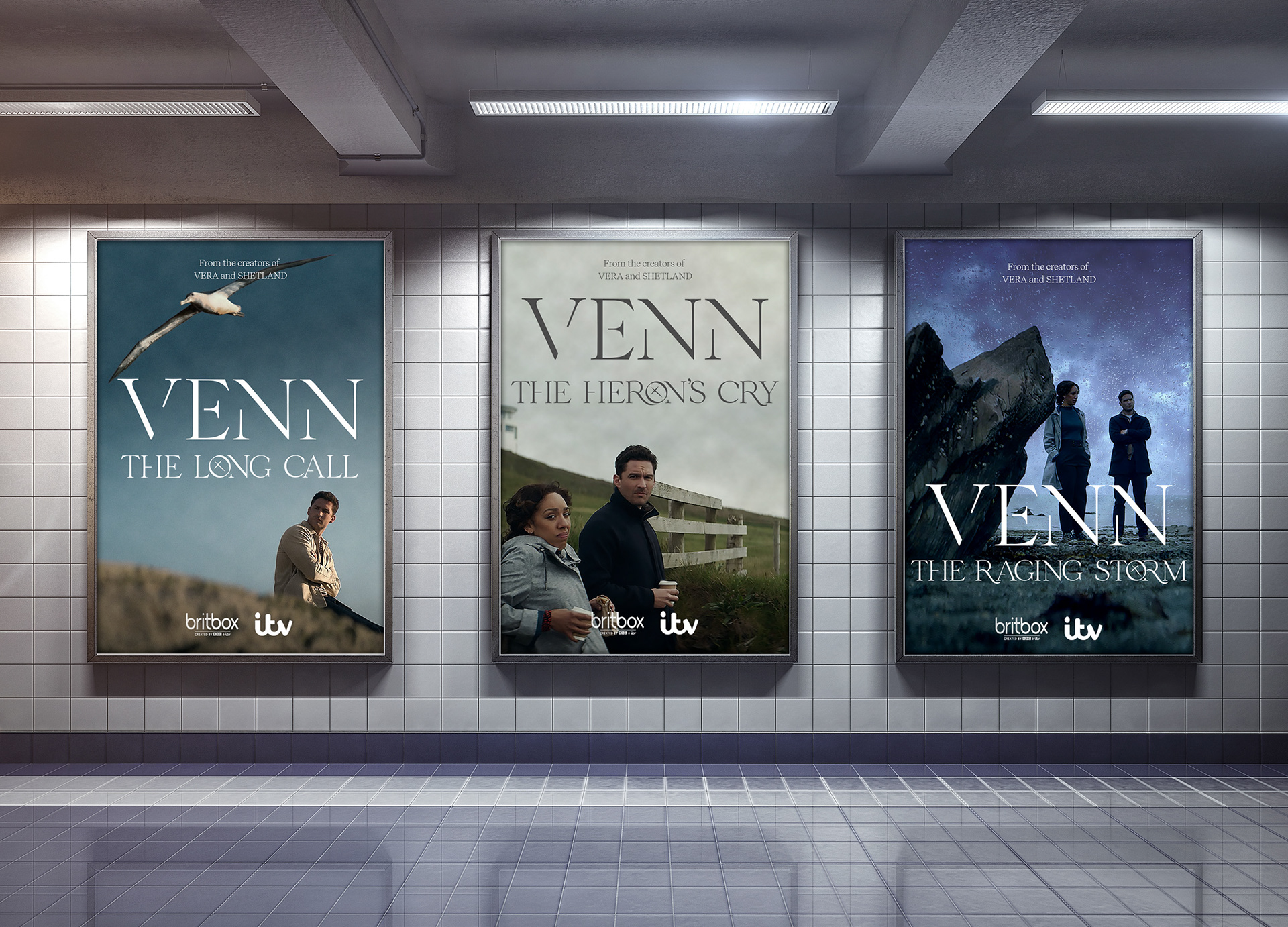
Billboards of each of the episodes
Social Media
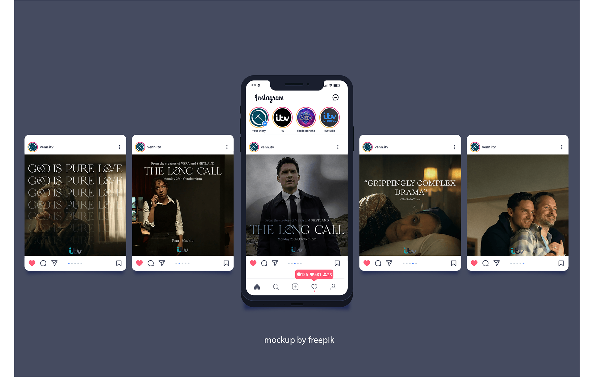
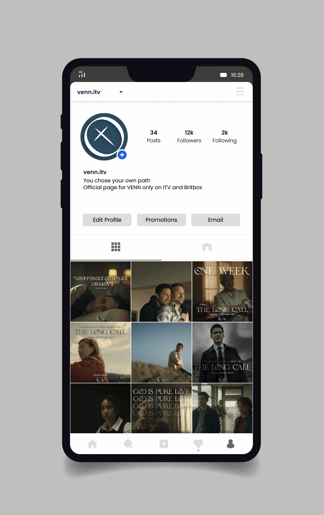
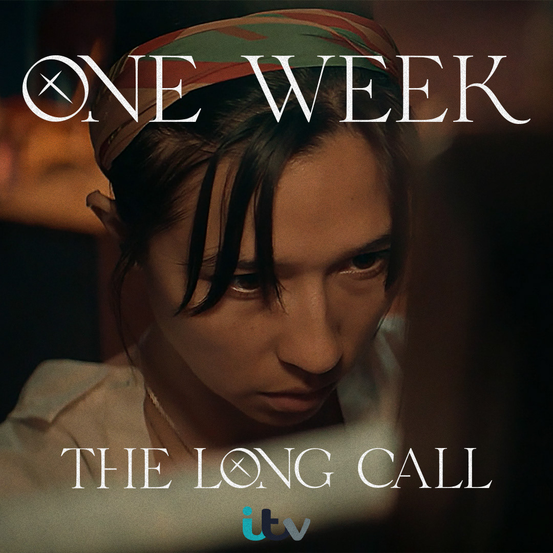
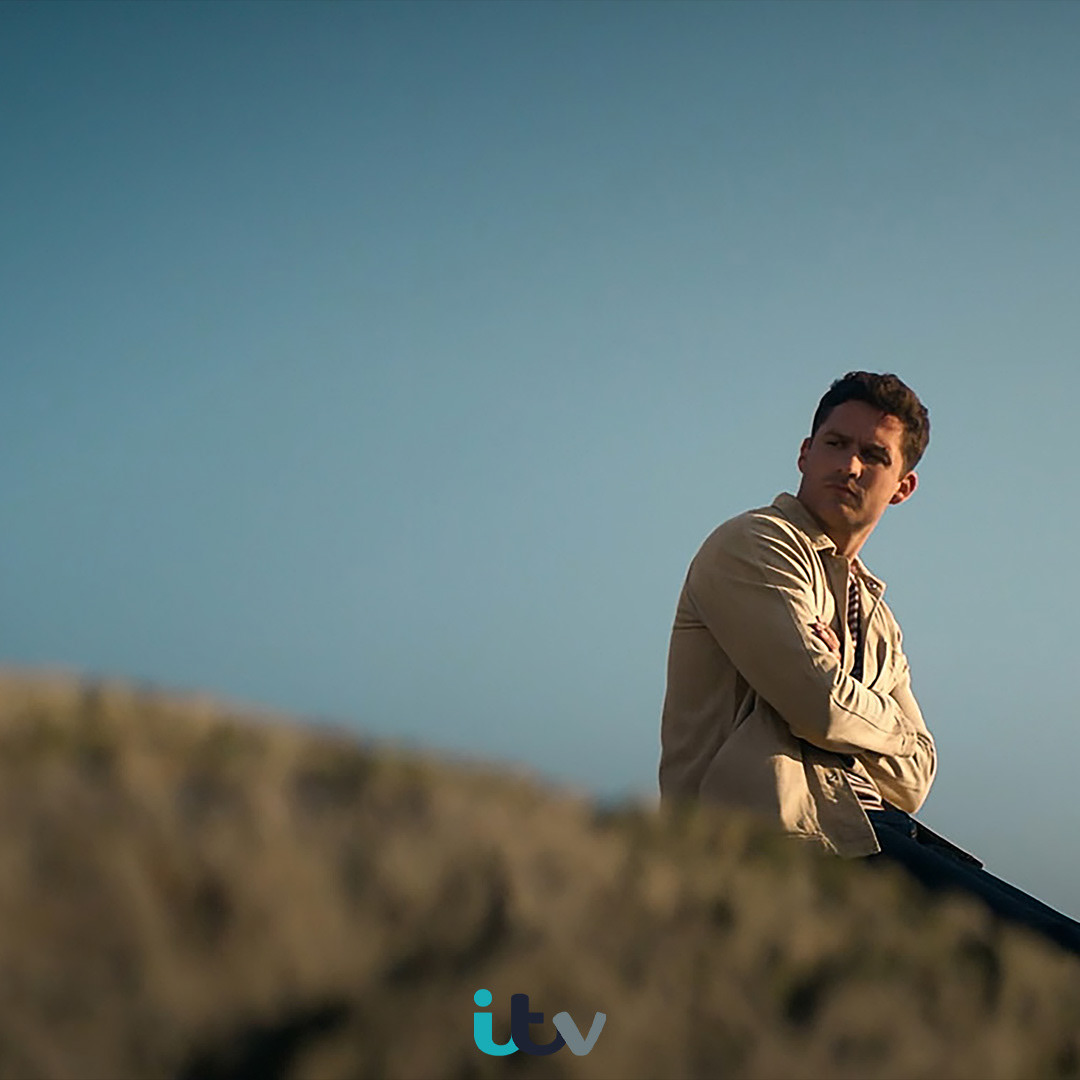
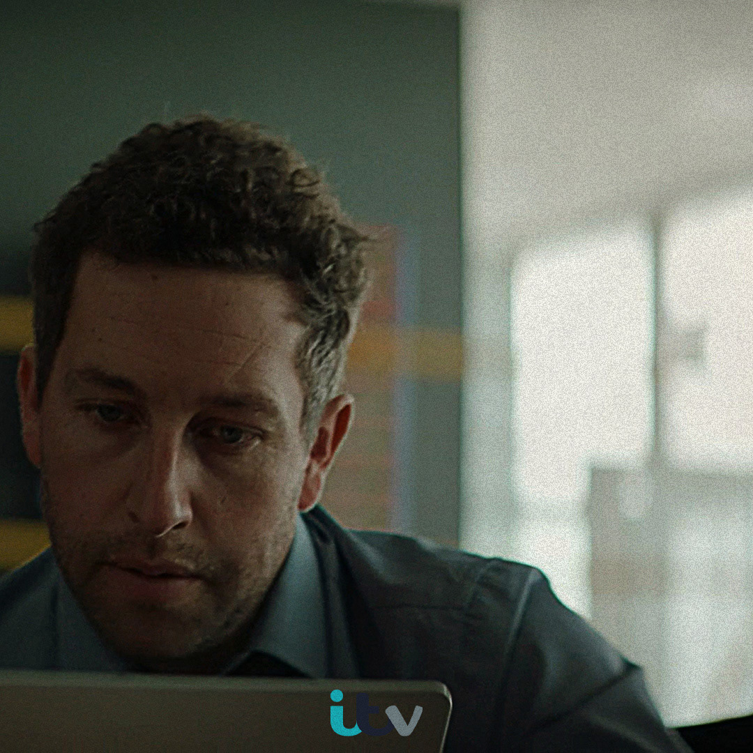
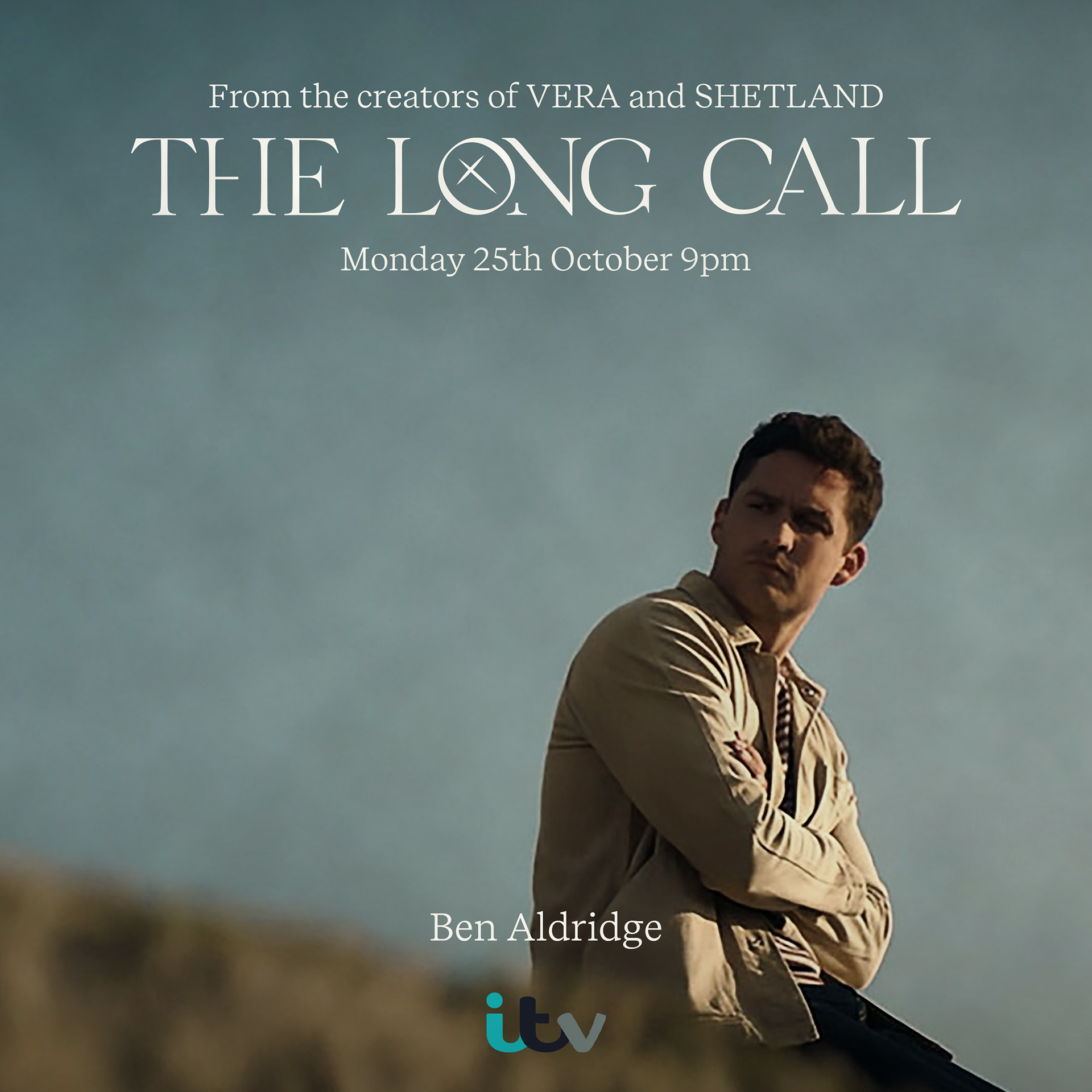
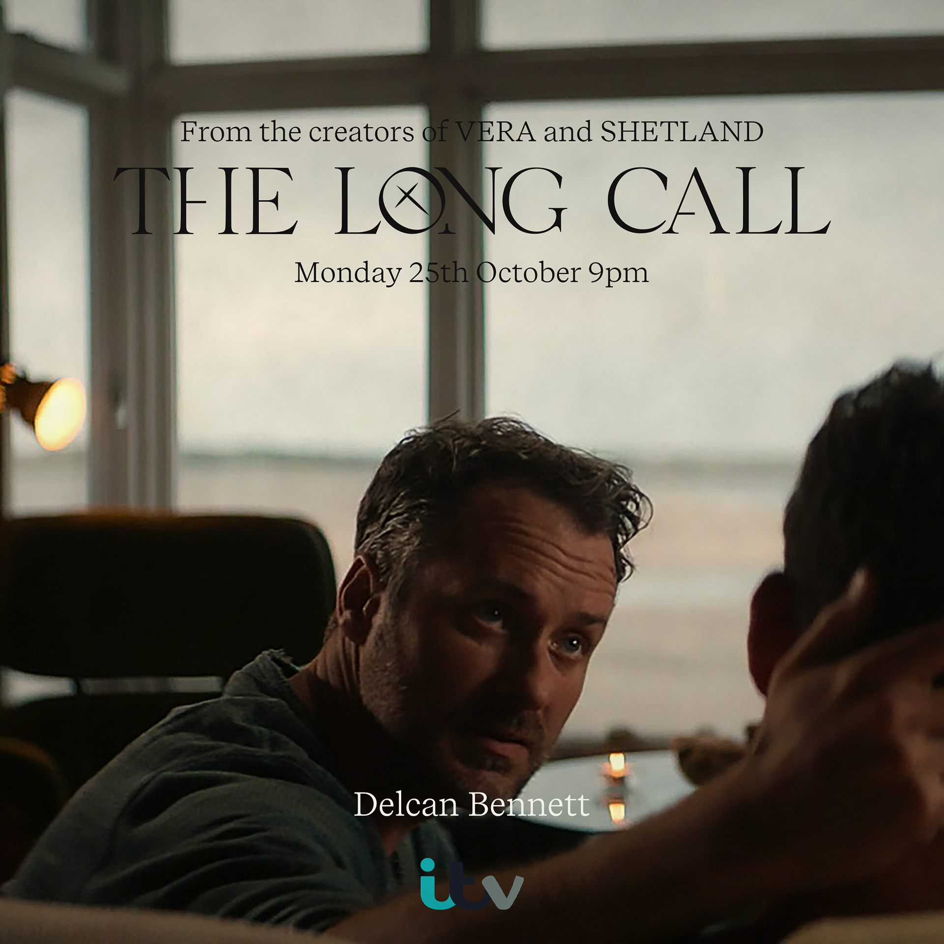
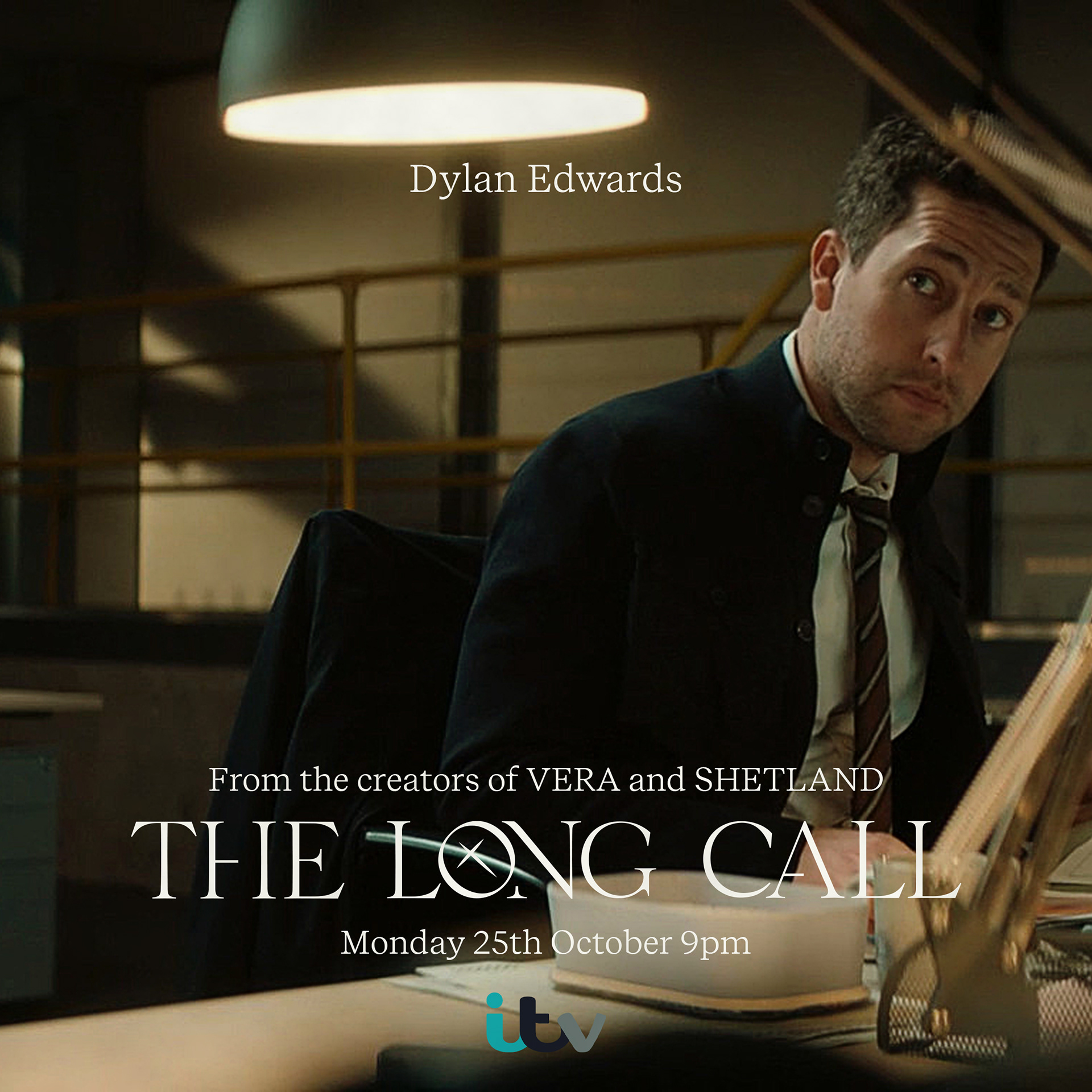
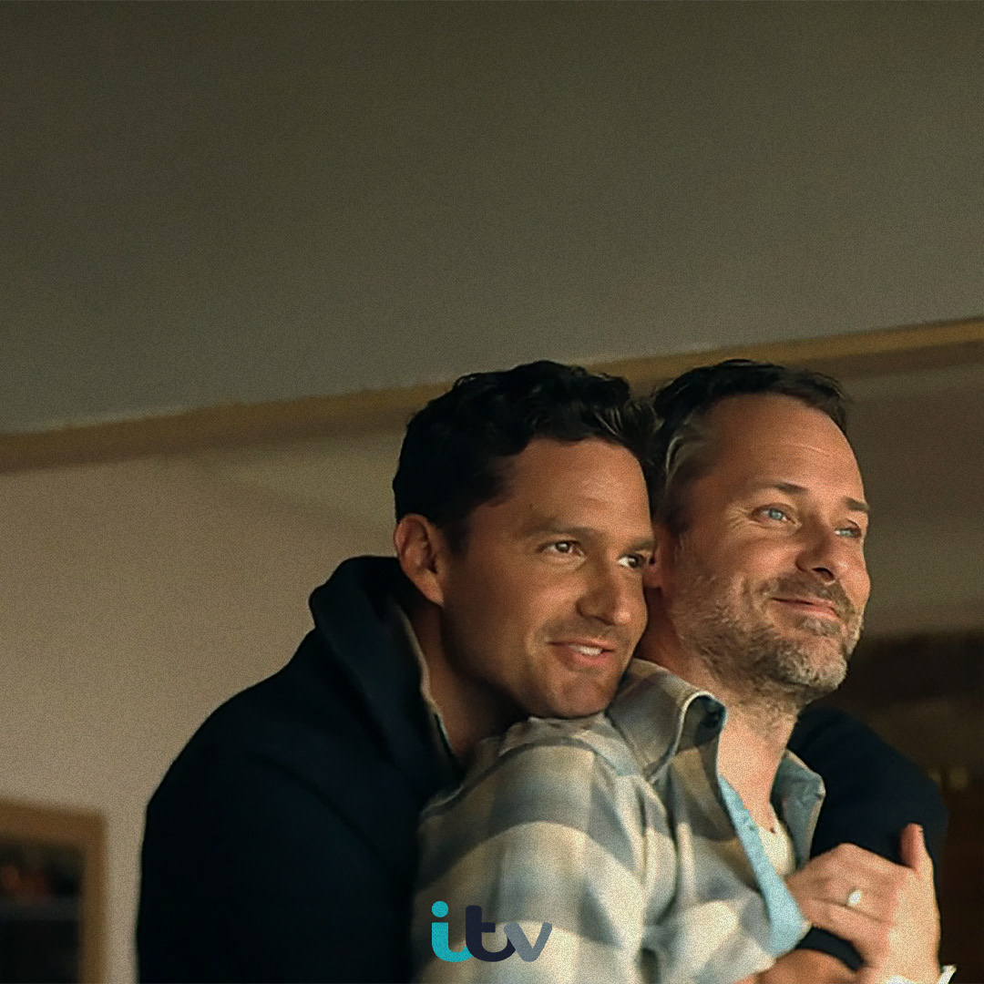
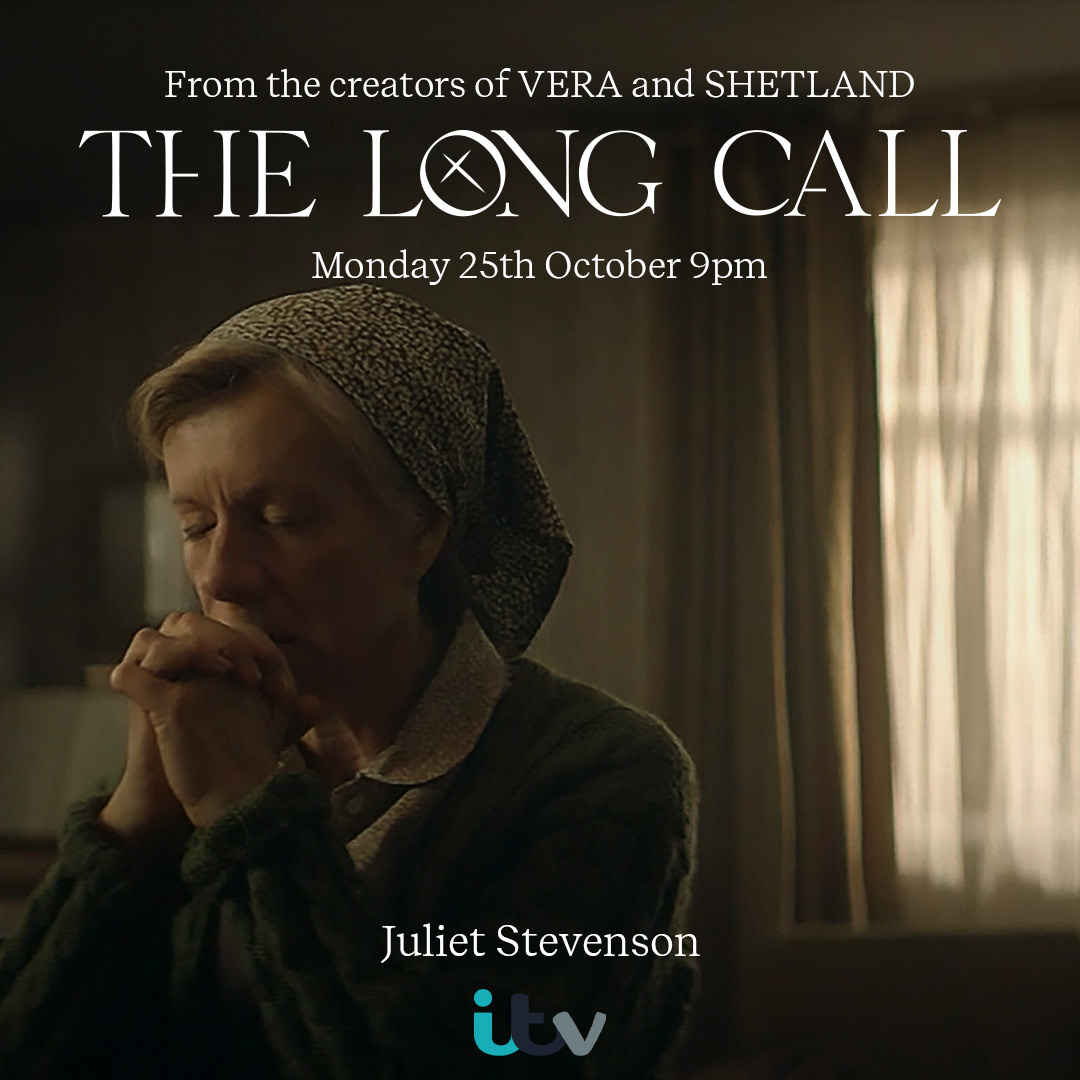
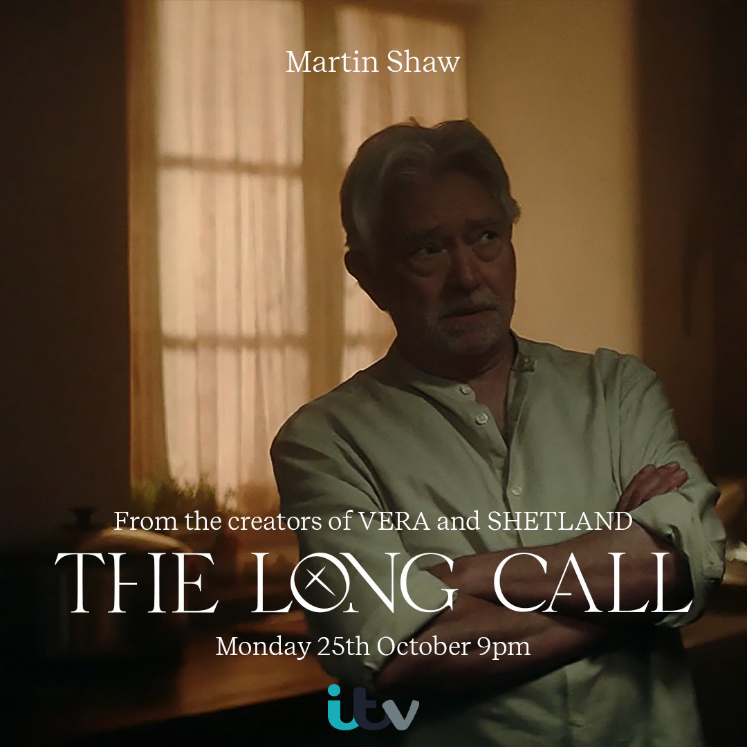
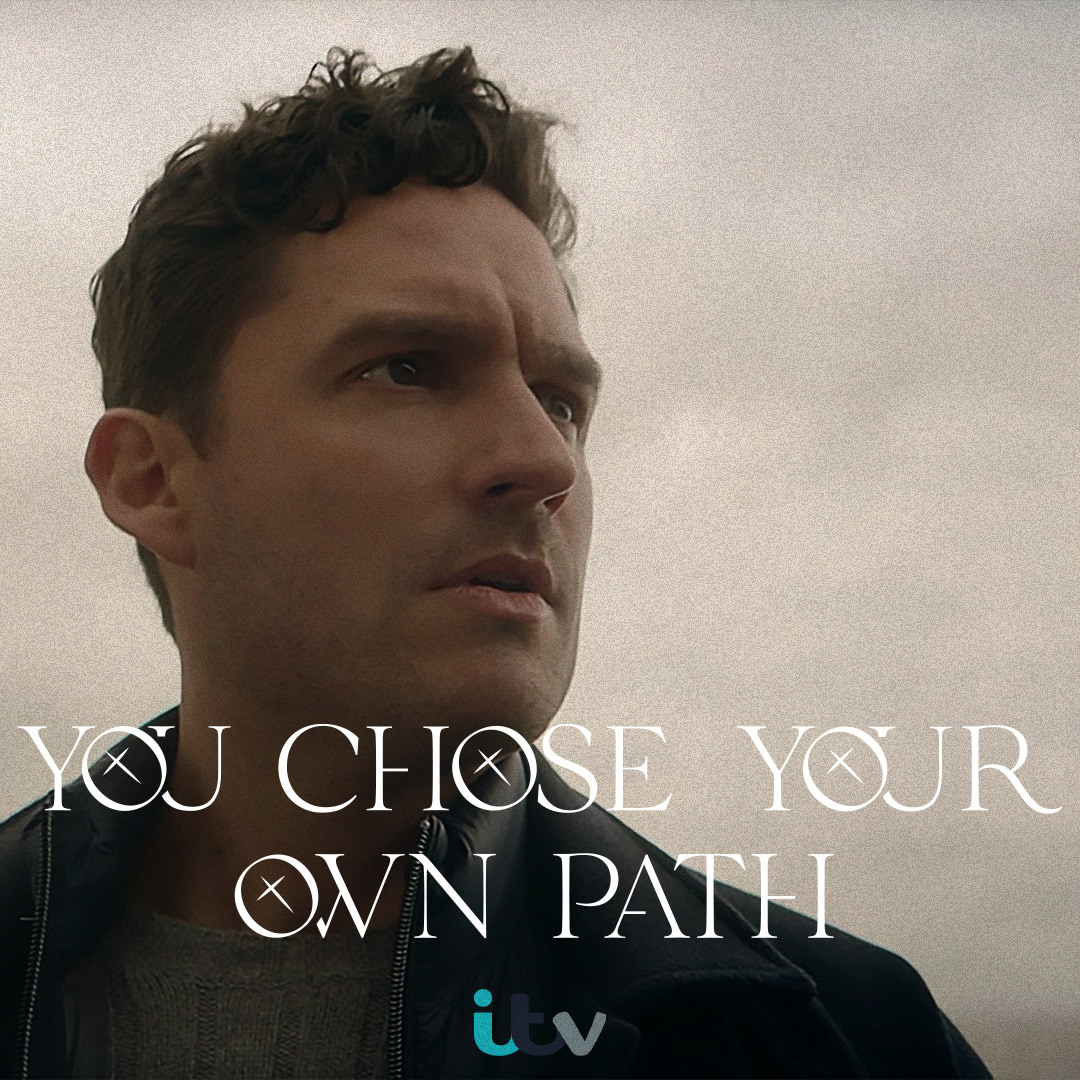
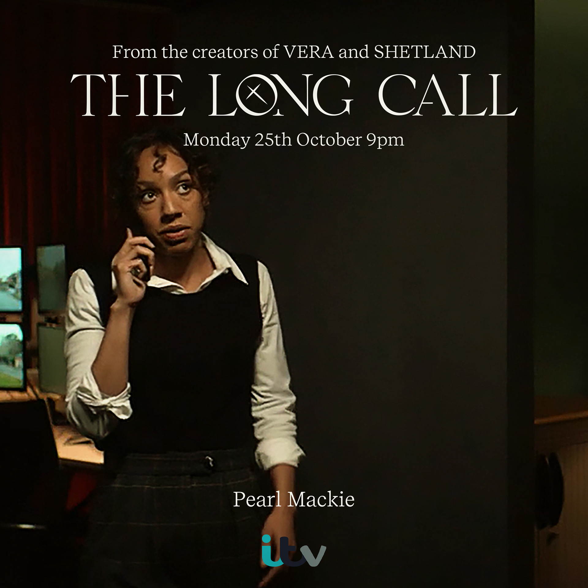
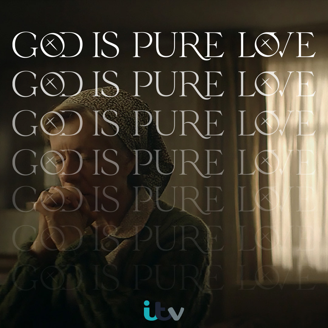
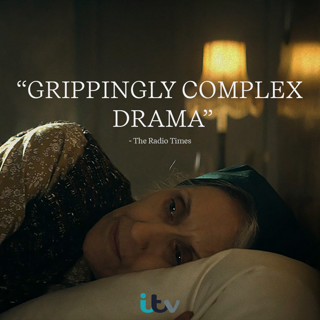
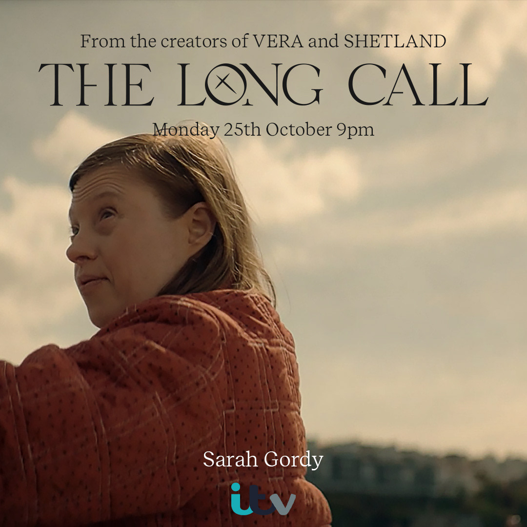
The different type of social media posts the show would have: Introducing cast members, quotes from the show, announcements, quotes from reviews and screen stills.
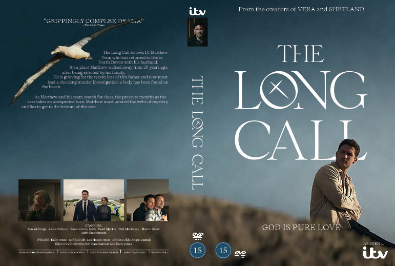
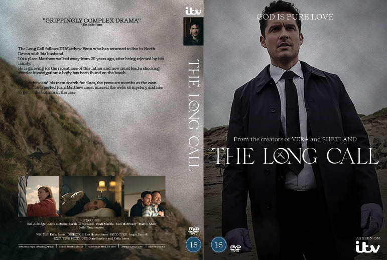
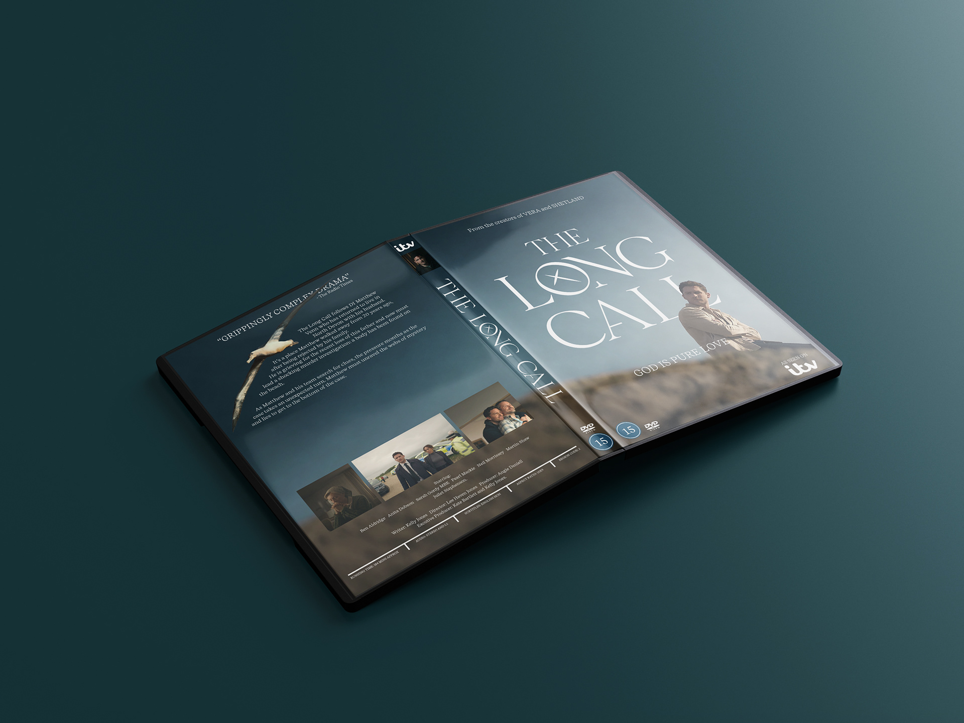
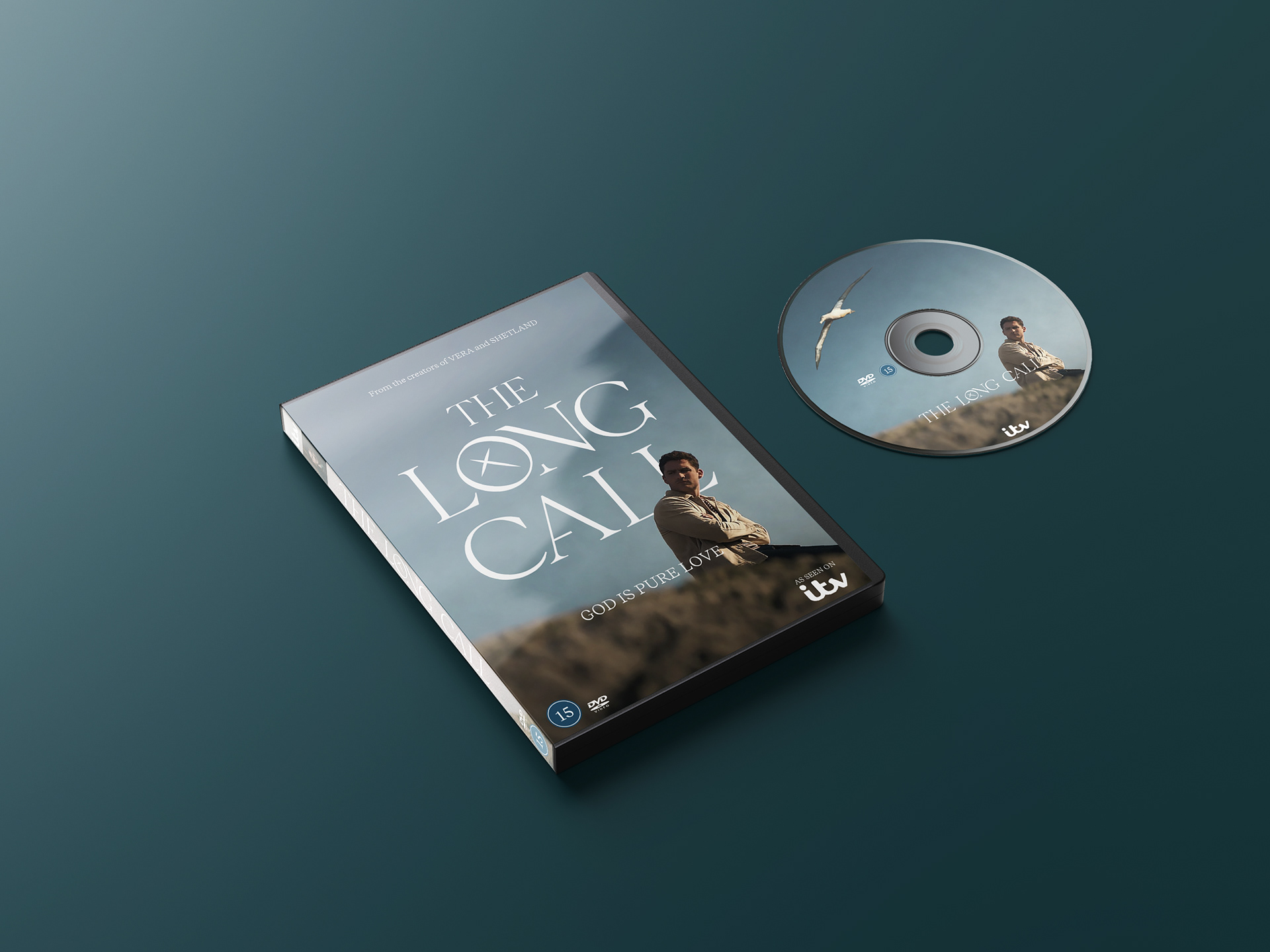
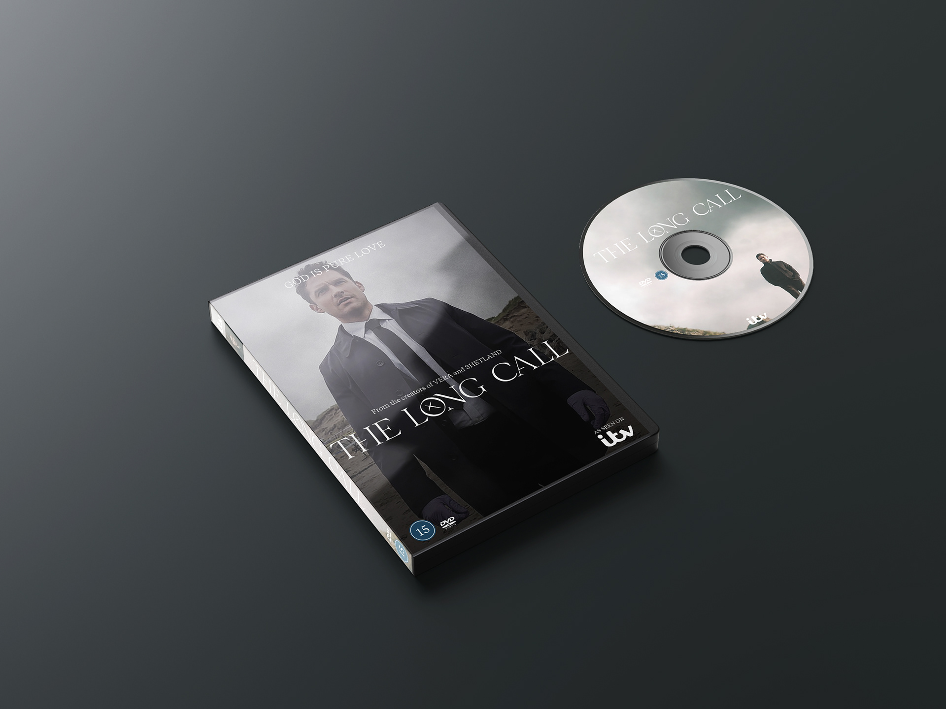
DVD cover redesign