Final Outcome

I chose Dead Poets Society because I love this film and how it sets a powerful message about individualism, society and conformity. The arc that one of the main characters, Neil Perry, goes through is incredibly eye-opening, and puts into perspective how important self-expression, individualism and choice are and how conformity can be detrimental.
The theme of my redesigned poster touches on this sense of freedom. I chose the image of the boys running out at night to go to the cave for their first poetry meeting because they are rebelling against the rules the school has placed on them, and the birds are to symbolise them taking flight and starting to learn their potential. It’s a more positive message the poster takes on compared to the ending of the film.
The Process
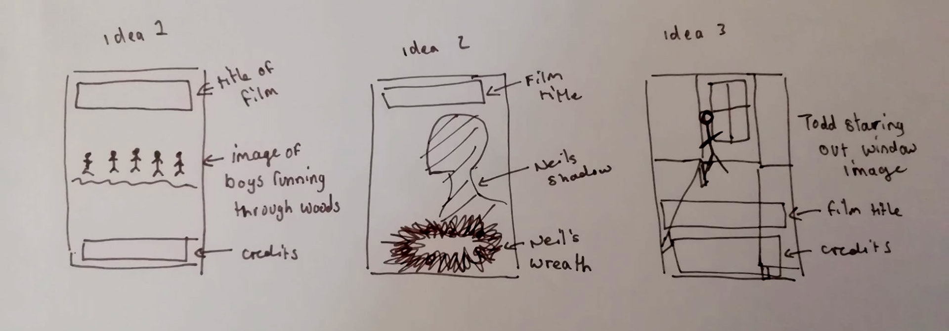
I first mapped out my three ideas as basic thumbnails - I took direct inspiration from the film's imagery itself, and wanted to use the screenshots from Dead Poets Society as the main image because of how beautifully the film was captured.
Idea 1: There is an image of all the boys running through the woods. I love this image, and I believe it would make a good centre image for the poster as they were silhouetted against the night sky.
Idea 2: There is an image of Neil's silhouette with his wreath in the foreground - I believe this image highlights Neil's loneliness he feels throughout the film when he is unable to be himself.
Idea 3: There is an image of Todd in his bedroom staring out the window, capturing the melancholy feel of the ending of the film.
I chose Idea 1 because it captured the theme of freedom and self-expression.
Typography
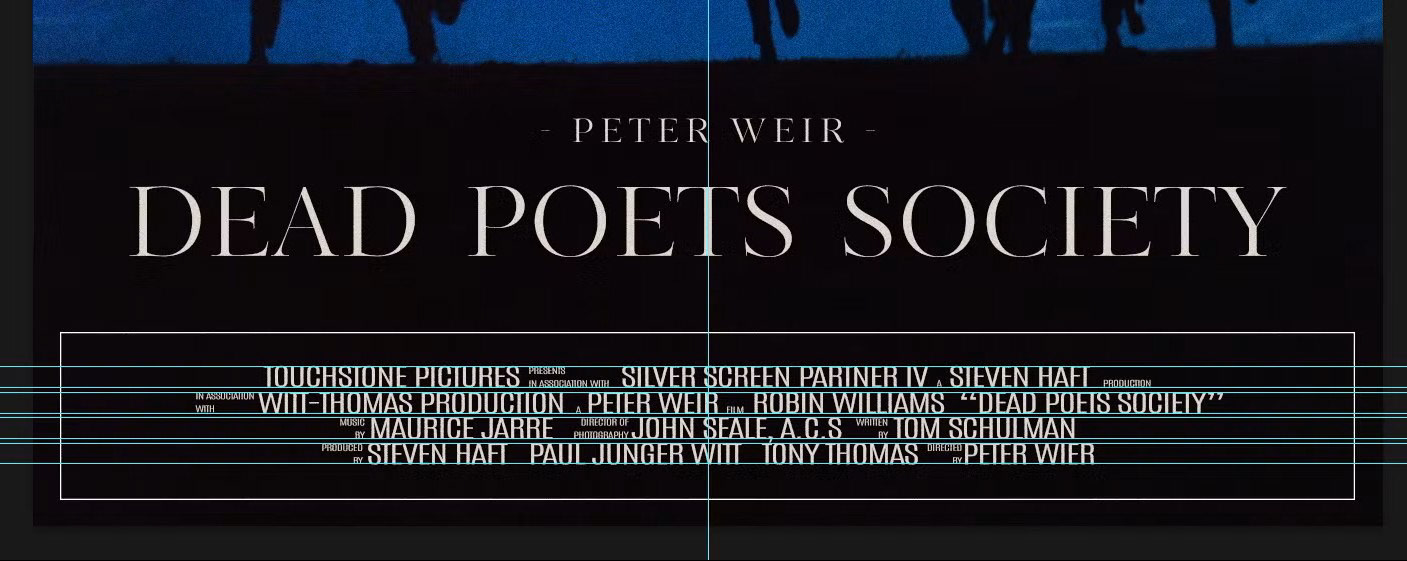
For the typography, I used the guides to help line up the copy for the credits at the bottom of the poster. I use the font Antonio and then manipulated the height and kerning to get the classic “squashed” look when you have credits on posters.
For the title of the film, I used the font Kudryashev Display because I wanted a classier and elegant typeface, since the film is set in the 1950s in a private school, and I believe the typeface should reflect that aspect of the film. In addition, it’s a good juxtaposition to the image of the boys running to their little bit of freedom they were able to carve out for themselves at the strict school.
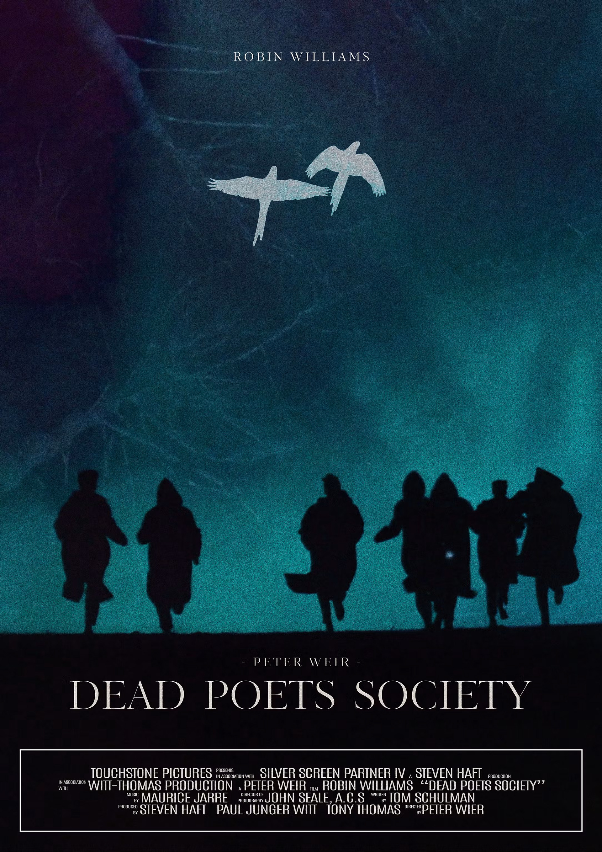
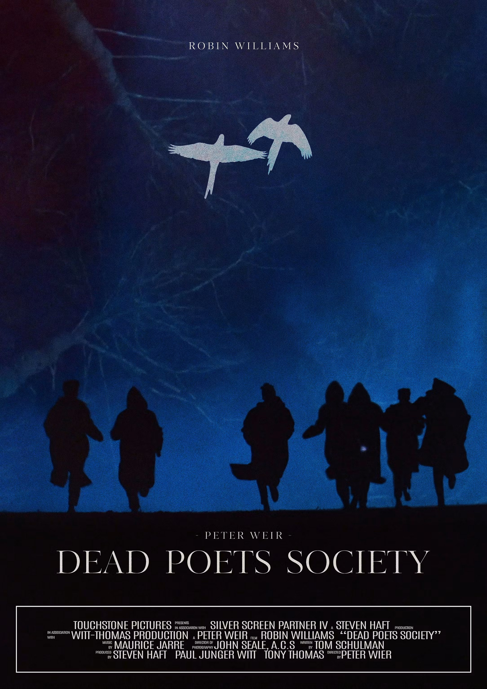
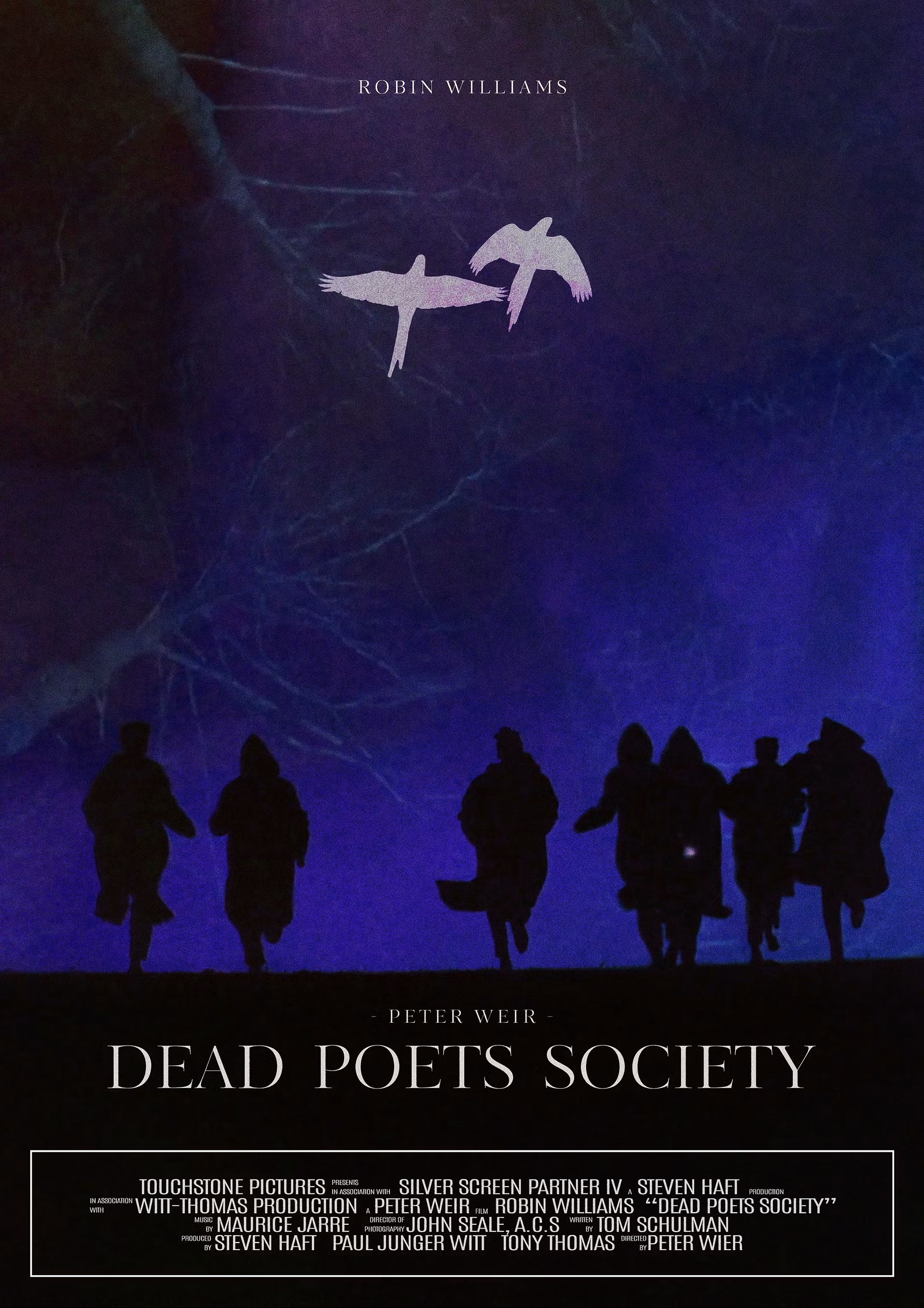
And I also experimented with colour variations with different skies, but went with the middle option of the dark blue.